The Color, the text, and the print make a successful Postcard
Custom postcards are a powerful marketing tool to reach out to new clients and get an immediate response. Despite all the emphasis on digital marketing today, postcard marketing is still effective, but often overlooked.
Nevertheless, direct marketing is experiencing a revival as small businesses rediscover how to get quick results with fresh and innovative direct mail pieces.
Postcards can serve a lot of purposes: to boost sales, generate new leads, launch a new product, or measure customer satisfaction. Whatever the goals for your postcards are, it all boils down to three features: the color, the text, and the print. These three features together are what makes a successful postcard.
Custom Postcards Quality
The Colors / Graphics
Use colors that represent your key brand elements: logo, overall color scheme, and design layout. Keep your design consistent with your branding elements throughout all your marketing materials for an easy-to-recognize brand. Your logo, although a central point of your brand identity, shouldn’t overshadow your offer.
Gather relevant images, that help to illustrate your product in only a few pictures. For example, using before and after pictures to advertise diet pills or nature shots for a camping supply store. Include only high-quality photos with a good resolution for printing (300 dpi). Use stock photography or shoot your own professional photos.
Get your message to stand out against your photos by using contrasting colors to highlight the most important information. If the headline is not the first eye-catching element on your design, you have to redo your design. You should also highlight the key benefits, the offer, and the call to action. Your color scheme should depend on what your audience considers appealing. Colors have the power to change our mood! As a general rule, it is considered that:

- Cool colors such as blue or green create a sense of calmness and comfort.
- While warm colors such as red or orange can seem more aggressive, drastic and passionate.
- If you want to look resourceful go with blue and orange.
- Mix your design with yellow for playfulness, pink for discretion and gold for a sophisticated look.
Does blue seem to be the most obvious choice? Think of what ideas and psychological effects do you want to convey besides your textual message.
The Message / Fonts
The headline is the first element the viewers will see. A catchy and clear headline will help your recipients to understand your proposal at first glance. It should pop up and communicate the essentials. Brian Clark in his recent article Copyblogger states that: “8 out of 10 people will read your headline, but only 2 out of 10 will read the rest”. It’s the headline’s job to make the reader flip the postcard and learn more about your offer.
Add to your headline a benefit of your product, a promise, or a solution to your reader’s problem. Spend extra time on crafting your headline, brainstorm ten to twenty headlines if needed and pick the very best one. Search for the most used words in headlines like limited time offer, grow your business, you and yours, the most, hacks, smart, surprising, etc.
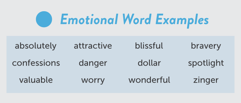
Finally, infuse your headline with emotions. Use highly emotional words and include emotional benefits. This way you’ll build a strong desire for what you have to offer. Make them feel excited, confident, or successful to entice them with your product.
See 13 Emotion-Based Headlines that Work

Start writing your postcard with the specific response you want to generate with your postcard. Do you want them to use a discount on your product? Make your point is clear from the beginning.
Give your postcard a short and simple message. Avoid cluttered large blocks of text. Make it easy to scan and read. Due to the postcard size and format, it can be challenging to communicate a detailed message. Keep the text to a minimum of 100 words or wrap it around a picture that is worth 100 words. So, maximize your space and use only the images that complement your text, or even better, an image that tells the story by itself. Say exactly what you need to say and nothing more.
Use bullet points to highlight the key benefits like full-service, friendly staff, or free shipping. This is also the place to highlight your special offer and the value of the deal. List the things that come with your main product/service: free consultations, discounts, free coffee. Mention anything that motivates your reader to quickly reach out to get in touch with you.
Considering the tone of your approach, consider using one of these guidelines:
- If you are targeting business executives of luxury buyers use a more conservative approach in language, color, layout.
- For career-oriented professionals use a casual fun approach.
- Reach younger folks with a more modern way of talking that includes new words, abbreviations, and emoticons, slang words, etc.
Proofread everything and double check details: phone number, web address, email, social media pages.
Limit your postcard to one or two font types. Use easy-to-read fonts. Go with the common Arial, when you have doubts. Or, use strong typography to stand out and quickly grab your reader’s’ attention.
The Print / Size
If you want to reduce your postage costs, use a lower paperweight for your postcard, but for a luxurious texture that stands out from the rest use thick high-quality paper stock.
When it comes to paper finishes, a gloss paper is usually the cheapest option and provides vibrant colors and a polished look. A matte paper is more expensive but more resistant to fingerprints and smudges, it also provides a luxury feel.
Choose uncoated stock if you want people to be able to write on your postcard. Photos and graphics also look much more vibrant on uncoated matte stock.
Make sure that your postcard meets the USPS mailing specification for postcard size, thickness, quantity.
Oversized postcards stand out in your mailbox and are a great choice if you want to include coupons or a map to your location.
You can also use non-standard elements, special cut-out or unique shaped postcards. Even though they make your business look distinctive, odd-shaped postcards aren’t cheap.
Follow these tips to make your postcard memorable. If you need assistance with your postcard marketing, give us a call or text us! Accurate Mailing Services team will gladly help you.


